UI / UX Design
Viva Supermarket
A ground-up mobile product concept translating an offline loyalty program into a confident digital experience.
Year :
2021
Industry :
Retail
Client :
Viva Super Market, UAE
Project Duration :
6 weeks
A mobile-first product concept designed to make loyalty points visible, usable, and trustworthy.

The First Digital Touch Point
Viva’s loyalty program existed primarily as an in-store, staff-dependent experience. Customers earned points, but had limited visibility into how, when, or where those points could be redeemed outside the checkout counter.

As Viva scaled, this created a growing gap between earned value and perceived value. Customers hesitated to engage with coupons, avoided advance redemption, and often lost points due to poor tracking and a lack of reminders.
This project mattered because the challenge wasn’t fixing a broken app — it was designing a first digital touchpoint that could translate an offline loyalty system into a confident, self-serve mobile experience.
My Role
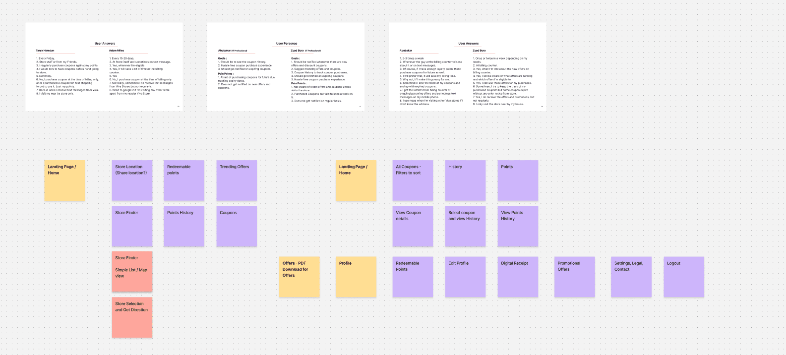
I led the UX for this ground-up product concept end-to-end. This included framing the problem, conducting user interviews, synthesising insights, defining information architecture, and designing core mobile flows for loyalty points, coupons, and store discovery.
Understanding Before Designing
Since there was no existing digital product to evaluate, I began by understanding how customers currently experience Viva’s loyalty program in their day-to-day shopping journey.
What initially appeared as low coupon usage was not a lack of interest, but a lack of confidence. Customers wanted to engage with loyalty points but felt uncertain about expiry, eligibility, and tracking once they left the store.
Key diagnostic questions
How do customers currently discover offers?
Why do they wait until checkout to redeem coupons?
What makes advance coupon purchase feel risky?
How do customers keep track of earned value today?
What would make a digital loyalty experience feel trustworthy?
This reframed the challenge from “adding features” to designing reassurance and clarity into the experience from day one.
Research Findings
From interviews and surveys with existing Viva customers, several consistent signals emerged:
Offer discovery is reactive
Most users learn about offers only at the billing counter or through irregular messages.High intent, low confidence
While all users expressed interest in purchasing coupons online, a majority avoided doing so because they feared losing track of expiry dates.Value feels abstract
Users know they earn points, but cannot easily see their history, usage, or remaining value in one place.Pre-visit planning is unsupported
Customers rely on external map apps to find stores and only engage with loyalty benefits once inside the store.
These signals defined what the first digital loyalty experience needed to solve.
Insight Shift
Problem | Intent |
|---|---|
Users hesitate to redeem coupons | Design for confidence, not urgency |
Loyalty points feel intangible | Make value visible and concrete |
Coupons feel risky | Surface expiry and history proactively |
Discovery happens too late | Enable engagement before store visits |
Journeys feel fragmented | Create a single, self-contained experience |
Design Exploration
Design exploration focused on defining what a first-time loyalty app should include—and what it should avoid.
Key considerations:
What information belongs on the home screen for users with no existing habits?
How much visibility reduces anxiety without overwhelming users?
How can loyalty, coupons, and store navigation coexist without clutter?
The direction prioritised predictable layouts, clear feedback, and minimal cognitive load over novelty or gamification.
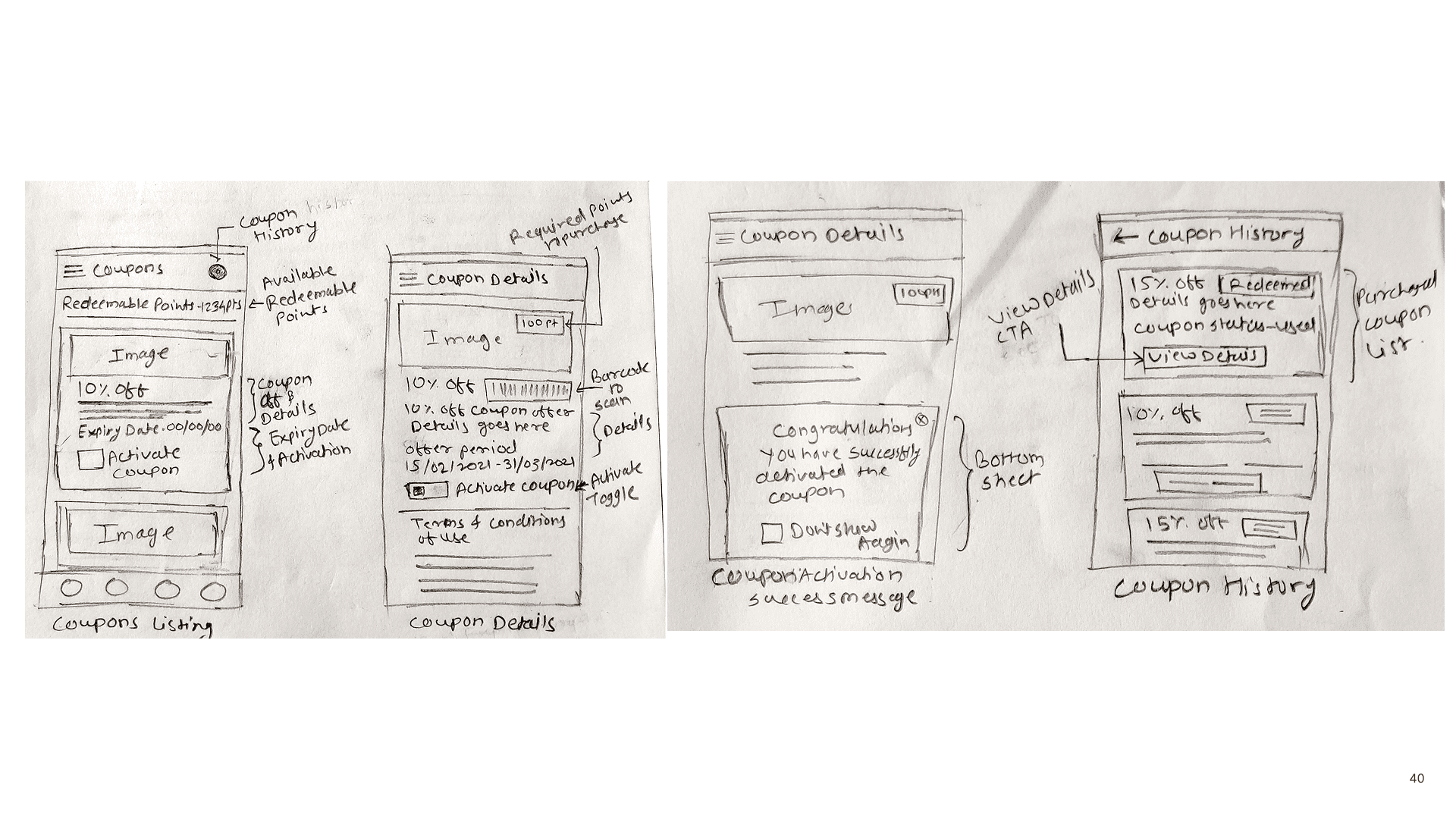
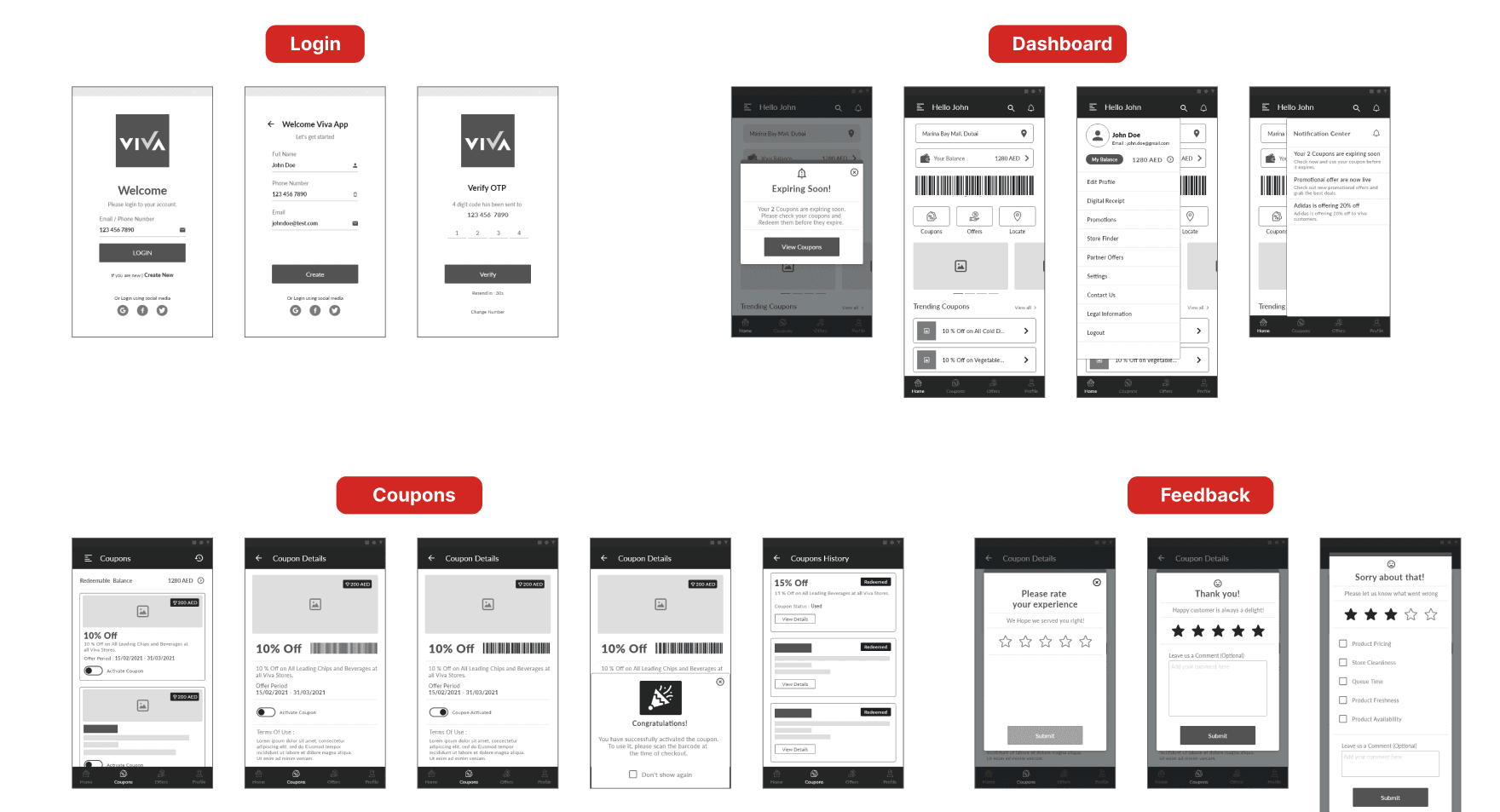
First Design Iteration
This iteration represents the first cohesive product concept, translating research insights into tangible flows.
What this iteration establishes
Immediate visibility into redeemable points and expiring coupons
Advance coupon purchase as a primary behaviour
Centralised coupon and points history
Integrated store finder without leaving the app
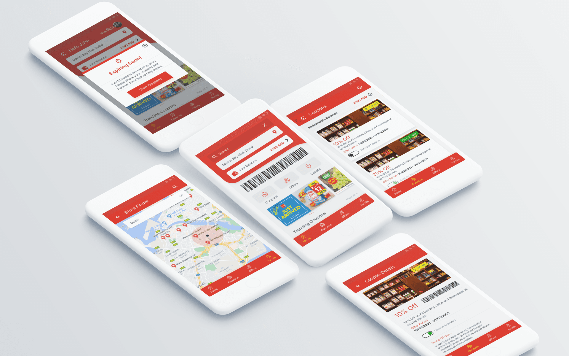
These screens demonstrate that the concept can support end-to-end loyalty journeys without reliance on in-store staff.
Current Status
This project reached a complete concept stage, covering discovery, redemption, tracking, and store navigation flows. While it was not taken to production, the work demonstrates how an offline loyalty system can be translated into a scalable, user-centred digital experience from scratch.
Reflection
This project reinforced an important lesson for me: in loyalty systems, clarity creates confidence. Before users care about saving more, they need to trust that what they’ve earned won’t be lost. Designing for reassurance proved far more impactful than designing for excitement.