UI / UX Design
MySyara
A vehicle service booking platform restructured for clarity, trust, and effort reduction
Year :
2021
Industry :
Automobile
Client :
M ySyara Car Services
Project Duration :
6 Weeks
Restructuring a vehicle service booking experience to reduce effort and restore user trust
Why This Project Mattered
MySyara operates in a space where convenience and trust are non-negotiable. Booking a vehicle service is often time-sensitive, and users expect the system to work reliably under imperfect conditions—network drops, payment failures, or last-minute changes.

The existing experience was breaking down at critical moments. Users struggled to add a car, payments failed without recovery paths, and once an order was placed, control was limited. These issues didn’t just affect usability—they increased customer support dependency and weakened confidence in the platform.
This project mattered because unresolved friction in a service product doesn’t remain isolated. It compounds across repeat usage, operational overhead, and long-term retention.
My Role
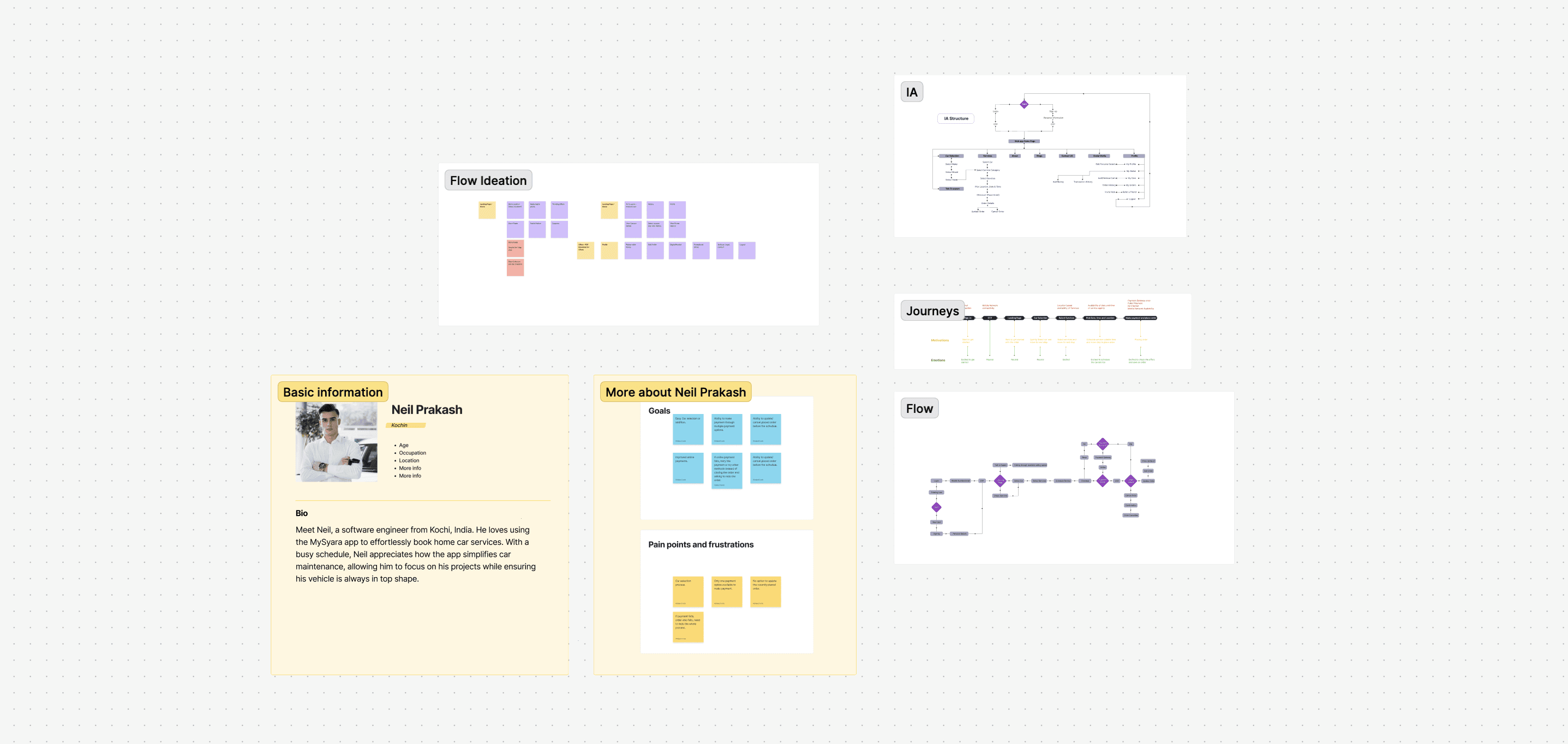
I led the UX restructuring from discovery through first high-fidelity execution.
This included reviewing the existing product, conducting user interviews, reframing the problem space, restructuring information architecture, defining flows, and translating insights into a responsive web-first experience that could scale to mobile.
Finding The Root Cause
At first glance, the product appeared functional. But using it end-to-end revealed disproportionate effort for simple tasks.
Rather than treating this as a redesign exercise, I approached it with a diagnostic mindset—looking for why users were slowing down, abandoning flows, or calling support.
I anchored discovery around a few guiding questions:
Where does a simple action turn into a multi-step burden?
What happens when the system fails—does it help users recover?
Which actions force users out of the product into manual support?
Are we designing for ideal connectivity or real-world usage?
Which moments most strongly influence user trust?
This helped surface structural issues that visual polish alone would not solve.
Audit / Research Signals
I reviewed the existing application and conducted user interviews across Dubai and Kochi. Despite geographic differences, the signals were consistent:
Car onboarding required excessive information, making a basic setup feel unnecessarily complex.
Online payments failed without recovery, forcing users to restart the entire booking.
Order updates were not supported in-app, pushing users to call customer care.
Service availability wasn’t clearly filtered by location, leading to wasted browsing.
Some users pre-loaded wallet balances as a workaround for unreliable payments.
These patterns indicated a product optimized for system constraints rather than user reality.
Insight Shift
Problem | Intent |
|---|---|
Car selection felt heavy and error-prone | Reduce car onboarding to only what’s required to proceed |
Payment failure cancelled the entire booking | Design payment as a recoverable step, not a dead end |
Users couldn’t modify placed orders | Give users control without relying on support calls |
Users explored unavailable services | Show only location-relevant services by default |
This shift guided every subsequent structural decision.
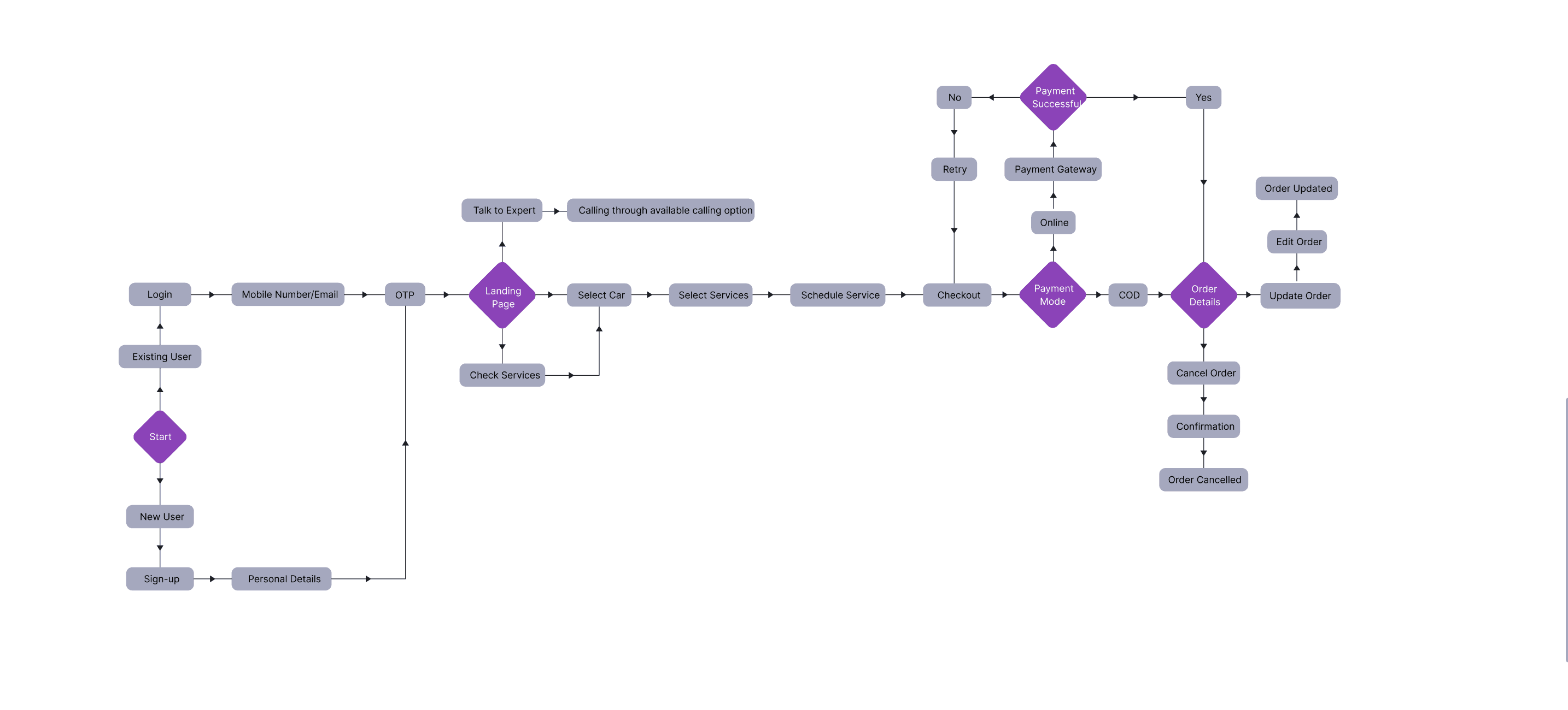
Design Exploration
Before moving to screens, I focused on restructuring how the system behaved.
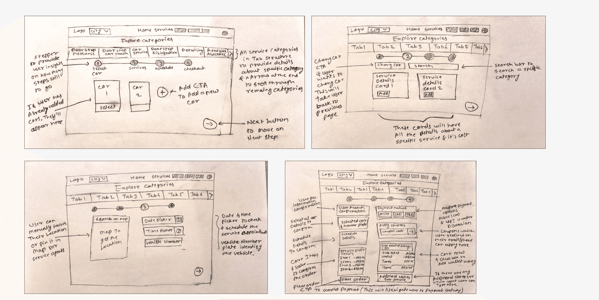
Key explorations included:
A 3-step car selection model (Make → Model → Year)
Separating order creation from payment success
Introducing order update and cancel states
Designing flows that tolerate poor connectivity and gateway errors
Reorganizing navigation around user tasks rather than features
Each exploration was evaluated against one question:
Does this reduce effort or anxiety at a critical moment?
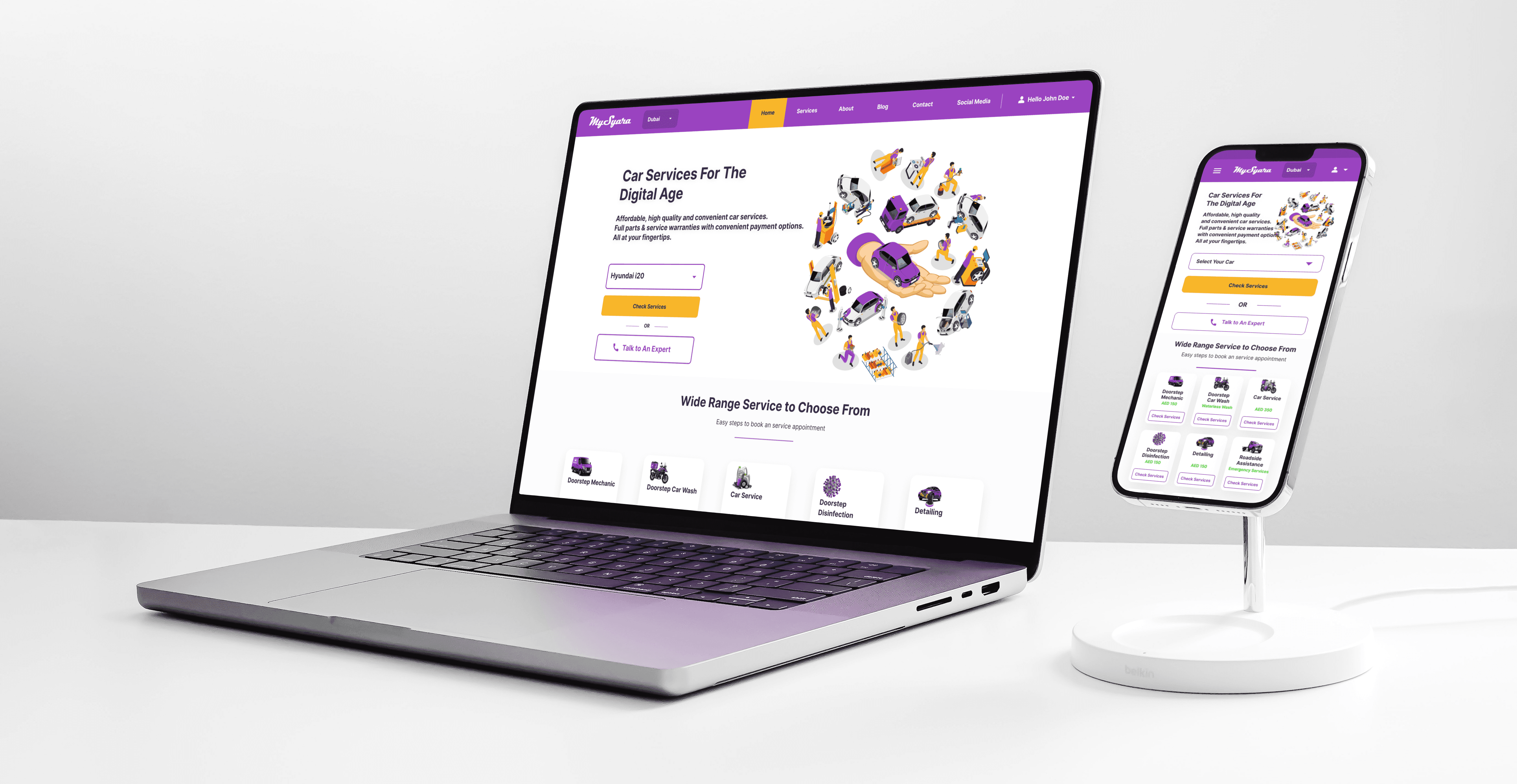
The Designs
The first high-fidelity iteration focused on validating structure, not visual polish.
This included:
A streamlined booking flow with fewer decision points
Clear retry paths for failed payments
Multiple payment options, including COD and wallet usage
Order management treated as a core experience, not an edge case
A responsive web-first layout designed to scale to mobile
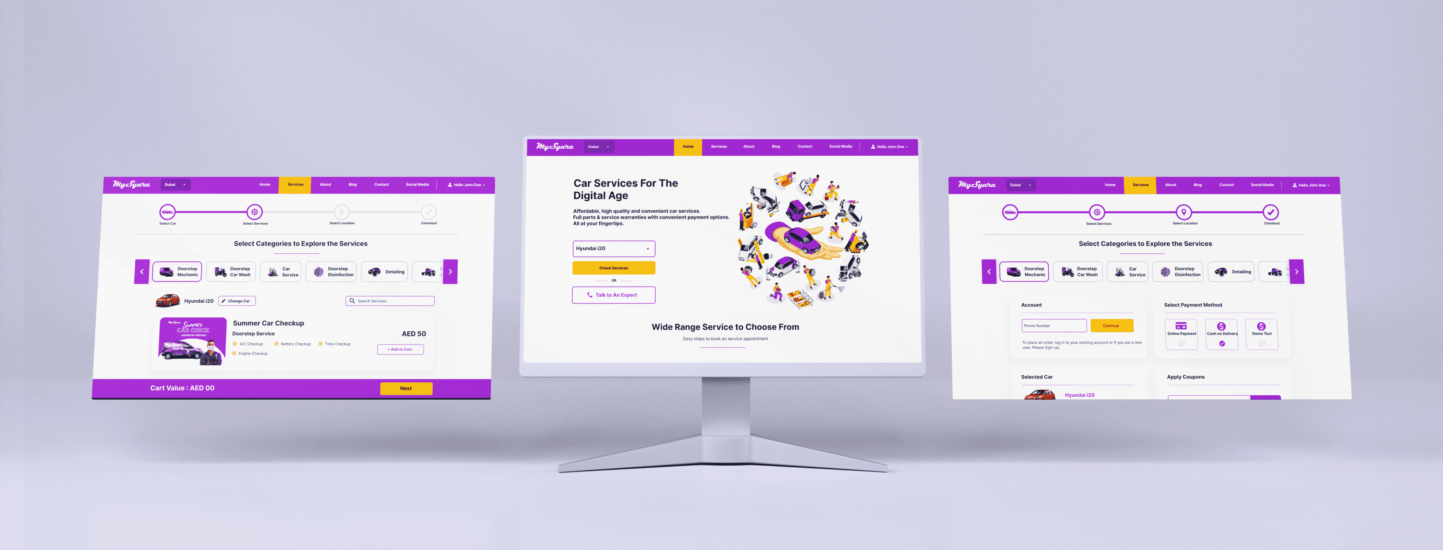
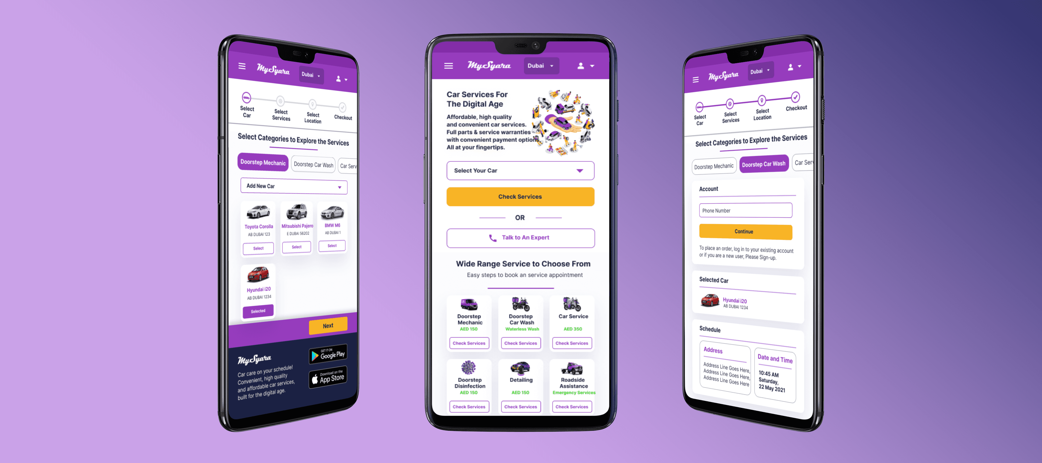
This iteration represented the first cohesive expression of the new UX intent.
Current Status
This project concluded with a complete UX restructuring and a validated direction for a unified web and mobile experience.
While future iterations would naturally follow post-launch, the foundational issues—effort, recovery, and user control—were structurally addressed in this phase.
Reflection
This project reinforced an important lesson:
When users invent workarounds, they’re not misusing the product—they’re compensating for its blind spots.
Good UX isn’t about adding more features.
It’s about removing the moments where users feel uncertain, stuck, or powerless.